








 GET QUOTE
Home / Editorial / The Best Wardrobe Colours for Modern UK Homes

14 Sep 2026
The Best Wardrobe Colours for Modern UK Homes
As domestic spaces continue to evolve to meet the demands of modern British living, one of the most structurally consequential yet frequently misunderstood elements of interior design is the selection of wardrobe color. A fitted wardrobe is not merely an inert wooden box designed to conceal clothing; it represents a monumental architectural surface that often commands between six and twelve square meters of vertical wall space. In modern UK properties—where ambient light varies drastically between overcast winter mornings and bright summer evenings—the color palette applied to large-scale cabinetry dictates spatial perception, circadian mood, and visual coherence. Selecting the best wardrobe colours for modern UK homes requires moving beyond fleeting social media fads. Homeowners must understand the technical physics of Light Reflectance Values (LRV), the color-rendering properties of northern versus southern daylight exposure, and the long-term durability of professional spray lacquers. In this exhaustive technical design guide, we examine the science, aesthetics, and material engineering of wardrobe color curation.
Key Takeaway: The Architectural Science of Wardrobe Color Selection
The optimal wardrobe color for modern UK residences is governed by three technical design metrics: Light Reflectance Value (LRV): Selecting tones with an LRV of 60% to 75% in smaller bedrooms to reflect ambient daylight without glare; Solar Orientation Calibration: Neutralizing cool, blue-tinted northern light with warm-based ochre, taupe, or greige undertones, while using deep navy, forest green, or charcoal to ground high-exposure south-facing master suites; and Substrate Coating Durability: Specifying two-pack (2K) polyurethane spray lacquers in dead-matte (5%) or satin (15% to 20%) sheens that resist finger oils and scuffs. High-specification painted millwork contributes a verified 4% to 8% capital valuation uplift to UK properties according to valuation benchmarks from the Royal Institution of Chartered Surveyors (RICS).
Introduction to Wardrobe Colours: Spatial Dynamics and Scale
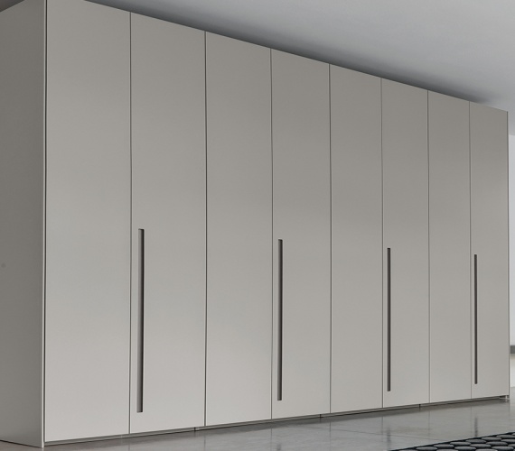
A bespoke wardrobe installation alters the architectural footprint of any bedroom. Unlike standalone accent pieces such as bedside tables or lounge armchairs, a fitted wardrobe spans floor-to-ceiling and wall-to-wall. Consequently, the surface finish of your cabinetry becomes the dominant backdrop of the room, rivaling or exceeding the square meterage of exposed perimeter drywall.
When a wardrobe color is poorly chosen, it can make an expansive room feel hollow and ungrounded, or make a modest room feel claustrophobic and dark. Conversely, an architecturally calibrated color scheme creates seamless visual flow, connecting en-suite bathrooms, dressing rooms, and main sleeping quarters into an integrated sanctuary.
1. The Concept of Visual Weight and Spatial Flow
In interior architecture, "visual weight" refers to how heavily an object pulls the eye within a spatial composition. Colors with low Light Reflectance Values (such as matte black, deep graphite, or midnight navy) advance toward the viewer, commanding immediate attention and creating an impression of solidity and enclosure. High-LRV shades (such as chalk whites, soft creams, and pale greiges) recede visually, reflecting available light and blurring the boundary between the cabinet carcass and adjacent walls.
Achieving spatial continuity in modern open-plan or broken-plan master suites requires matching the wardrobe elevation to the room's wider visual pathways. In a bedroom that leads directly into a private dressing area, matching the cabinetry finish across both zones prevents jarring visual breaks, making the overall floor plan feel larger and more cohesive.
2. The Specific Climate and Daylight Challenges of the UK
Color choices in the United Kingdom must account for distinctive geographic and climatic conditions. The UK sits at a high latitude (50°N to 58°N), which produces lower solar angles, shorter daylight hours in winter, and a high frequency of diffused, overcast cloud cover throughout the year.
Colors that look warm and luminous in Mediterranean or Californian architectural photography can appear cold, flat, or muddy under grey British skies. Selecting the right wardrobe color requires auditing how natural light enters the space throughout the changing seasons.
To understand how customized joinery systems integrate into broader home renovations, explore our design resources on fitted wardrobes design standards and our regional expertise in bespoke wardrobes in Harrow.
Most Popular Wardrobe Colours for Modern UK Homes
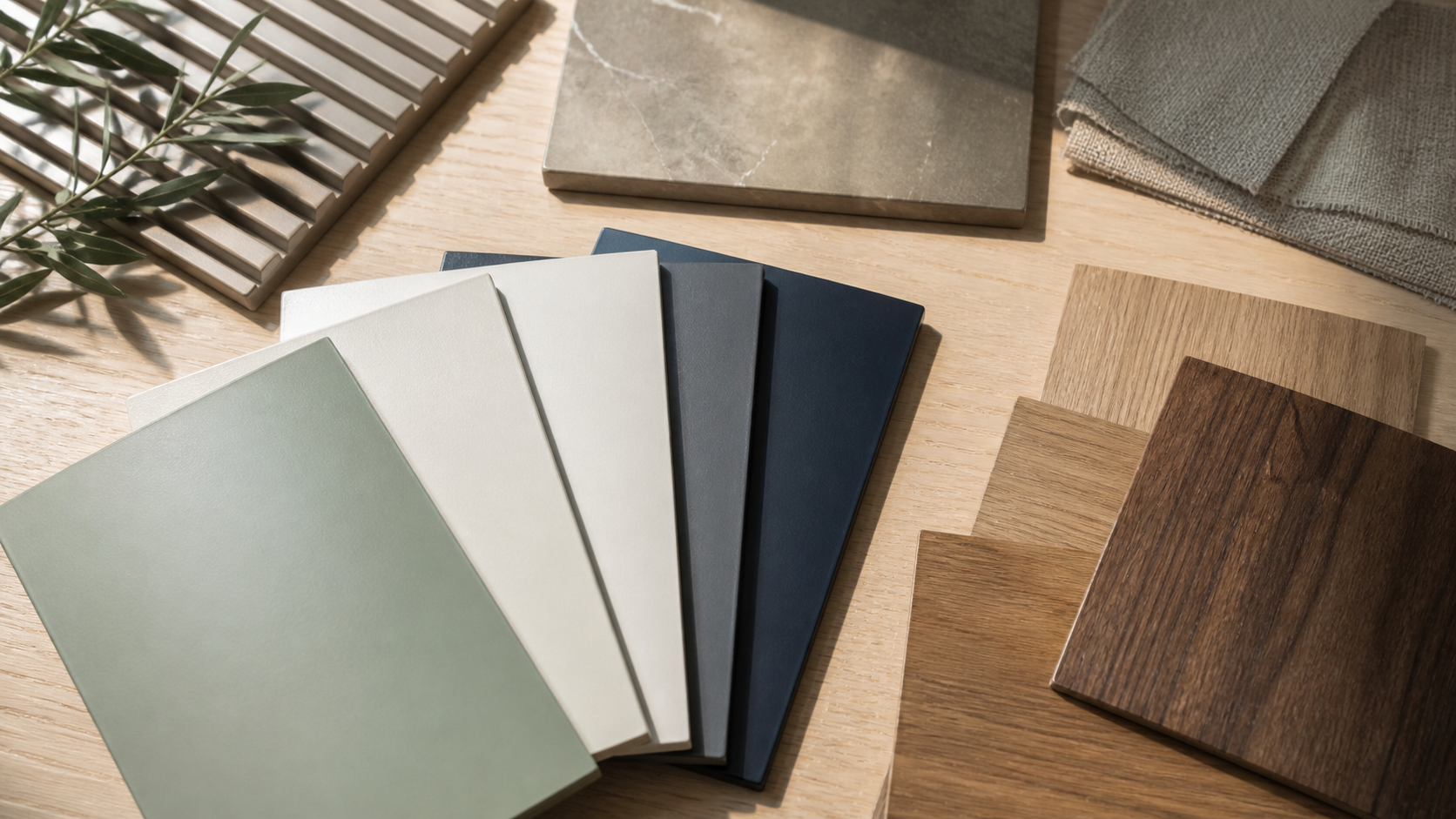
Contemporary architectural millwork across the UK has moved away from high-gloss plastic finishes and flat synthetic laminates. Today's premier residential projects prioritize sophisticated, multi-tonal pigments that interact elegantly with changing daylight.
| Color Classification | Representative UK Color Shades | Average LRV Range | Optimal Room Orientation & Lighting |
|---|---|---|---|
| Architectural Soft Neutrals | Cashmere, Warm Greige, Pumice, Pale Taupe | 60% – 75% | North- and East-facing rooms; low natural daylight |
| Deep Heritage Blues | Midnight Navy, Oxford Blue, Indigo, Ink | 8% – 18% | South- and West-facing rooms; expansive master suites |
| Muted Biophilic Greens | Sage, Eucalyptus, Olive, Mineral Green | 35% – 50% | East-facing morning rooms; light oak flooring schemes |
| Chalk & Warm Whites | Washed Linen, Slaked Lime, Alabaster, Bone | 75% – 88% | Compact bedrooms; loft eaves with sharp ceiling angles |
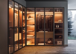
| Rich Architectural Darks | Charcoal, Fumed Oak, Smoked Graphite, Bronze | 5% – 12% | Luxury walk-in dressing rooms; high-lux LED displays |
1. Soft Neutrals: Cashmere, Greige, and Pale Taupe
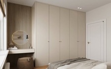
Soft neutrals represent the most specified finish in modern British architectural joinery. Unlike stark, clinical brilliant white—which can cast cold blue shadows under overcast British skies—shades like cashmere and greige contain warm yellow, red, and umber micro-pigments.
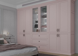
These complex undertones absorb harsh morning light while reflecting a warm, welcoming glow in the evening. Soft neutrals are exceptionally versatile, pairing seamlessly with natural white oak timber floors, bronze ironmongery, and bouclé upholstery.
2. Deep Heritage Blues: Midnight Navy and Dark Indigo
Deep blues add classical elegance and modern sophistication to executive master suites. A midnight navy fitted wardrobe creates an immediate architectural anchor, turning plain walls into a deliberate design statement.
When pairing dark navy doors with warm satin brass or knurled bronze handles, the contrast feels rich and intentional. Deep blues work best in south-facing bedrooms that receive abundant afternoon sunlight, which highlights the subtle depth of the blue pigment without letting the casework feel somber.
3. Muted Biophilic Greens: Sage, Olive, and Forest Tones
Biophilic design principles emphasize the psychological benefits of connecting domestic interiors with the natural world. Muted, desaturated greens—such as soft sage, dried thyme, and deep olive—introduce calming organic qualities to the sleeping quarters.
Green pigments naturally relax the eyes and help lower resting heart rates, making them an exceptional color choice for bedrooms. Sage and mineral greens pair effortlessly with natural timber accents, neutral stone surfaces, and linen window drapery.
4. Warm Chalk Whites and Alabaster
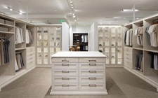
For compact urban apartments or rooms with low ceilings, warm off-whites remain a timeless standard. The key is avoiding stark, titanium-based "hospital whites." Instead, choose architectural whites blended with subtle drops of ochre or grey.
Warm chalk tones reflect maximum natural light (LRV 80%+) without glaring under artificial lighting. When scribed directly to ceiling cornices, an alabaster or warm white wardrobe blends into the surrounding walls, making compact rooms feel open and airy.
To see how bespoke painted cabinetry integrates with wider bedroom layouts, explore our complete technical guide on planning custom built wardrobes and our custom designs for luxury walk in wardrobes.
The Science of Room Orientation and Light Reflectance Value (LRV)
The perceived beauty of a wardrobe finish depends fundamentally on the physics of light reflection. Selecting a color swatch in an artificially lit design showroom without evaluating the home's natural light exposure often leads to unexpected and disappointing results on site.
1. Deconstructing Light Reflectance Value (LRV)
Light Reflectance Value is a standardized scientific metric that measures the total percentage of usable, visible light reflected by a color surface when illuminated by a standard light source. The scale runs from 0% (which absorbs all light, representing pure black) to 100% (which reflects all light, representing pure white).
- High-LRV Finishes (70% to 85%): Recommended for compact urban bedrooms and rooms with small windows. High-LRV cabinetry maximizes ambient daylight bounce, minimizing the need for artificial daytime lighting.
- Mid-LRV Finishes (35% to 65%): Includes cashmere, sage greens, and warm greiges. These tones absorb excess direct glare while reflecting enough light to prevent shadow pooling in room corners.
- Low-LRV Finishes (5% to 25%): Includes deep navy, charcoal, and dark graphite. These dark surfaces absorb significant daylight, requiring carefully placed, low-glare artificial lighting to prevent the room from feeling overly dim.
2. Calibrating Colors to the Cardinal Directions
The orientation of your bedroom windows directly determines the color temperature of the natural light entering the space:
- North-Facing Bedrooms: Natural light from the north is consistently cool, diffuse, and blue-tinted. Cool grey or pure white paint finishes will read as cold, flat, and clinical in these rooms. Always specify warm-based neutrals—such as cashmere, light greige, biscuit, or warm cream—with subtle yellow, pink, or red undertones to balance the cool northern light.
- South-Facing Bedrooms: These rooms receive intense, warm, golden sunlight throughout the day. Warm whites can sometimes flare yellow in strong south-facing light. South-facing rooms easily balance cooler color palettes, making them the perfect setting for pale slate greys, crisp mineral blues, soft sage, or deep midnight navies.
- East-Facing Bedrooms: East-facing rooms experience bright, warm morning sunlight followed by cool, shaded afternoon light. Balanced neutrals with subtle green or warm stone undertones adapt gracefully to this shifting daylight balance.
- West-Facing Bedrooms: Morning light in west-facing spaces can feel dull, but turns into warm, intense golden light late in the afternoon. Avoid overly saturated warm yellows or oranges, which can look overly hot in the evening sun; instead, opt for balanced greiges or muted earthy tones.
"Color is not a static property of timber or lacquer; it is an ongoing interaction between pigment chemistry and solar orientation. A paint formula that looks warm in a southern bay window can appear cold and grey in a northern alcove."
— Architectural Color Consultation & Spatial Lighting Consensus
The Neuro-Aesthetic Impact of Wardrobe Colours on Sleep and Wellbeing
The master bedroom is an intimate domestic environment dedicated to physical rest, neurological recovery, and stress reduction. Clinical research in neuro-aesthetics and environmental psychology reveals that surrounding color palettes directly influence autonomic nervous system arousal, evening melatonin production, and morning cognitive focus.
1. Color Psychology in the Sleeping Environment
Clinical studies published by the National Sleep Foundation confirm that visual environments characterized by high-saturation primary colors (such as vibrant reds, bright oranges, or intense yellows) stimulate brain wave activity and elevate heart rates. This sensory stimulation makes it harder for the mind to unwind before sleep.
Conversely, low-saturation, desaturated colors encourage parasympathetic nervous system activity:
- Muted Blues and Teals: Studies consistently link blue spectrums to lower blood pressure and reduced respiratory rates, helping prepare the body for deep rest.
- Soft Earth Tones: Grounding neutrals like taupe, clay, and sand evoke natural landscapes, fostering a sense of domestic security, stability, and calm.
- Visual Serenity Through Concealment: Scribing full-height cabinetry flush to the ceiling conceals clothing and accessories behind quiet, opaque panels. This removes the visual noise that often causes low-grade morning anxiety.
2. Balancing Color Continuity: The 60-30-10 Interior Rule
To maintain a harmonious, designer-grade master bedroom, apply the classic 60-30-10 spatial color distribution formula:
- 60% Dominant Base Color: Allocated to the largest surface areas—the perimeter walls, ceiling, and main wardrobe casework. This dominant tone sets the foundational mood of the room.
- 30% Secondary Architectural Texture: Applied to secondary architectural surfaces—such as natural timber flooring, upholstered headboards, area rugs, and window drapes.
- 10% Expressive Accent Personality: Reserved for focused decorative accents—such as wardrobe door handles (brushed brass, knurled bronze, or matte black), bedside lighting fixtures, and artwork.
To see how bespoke sliding mechanisms solve floor clearance challenges in narrow layouts, explore our specialized solutions for bedroom sliding doors near me.
Substrates, Lacquers, and Technical Finishes for Fitted Wardrobes
The long-term performance of your wardrobe color depends on the underlying timber substrates and the chemistry of the paint coatings applied during fabrication. A beautiful color will quickly lose its appeal if the finish chips, shows greasy fingerprints, or peels away along door edges.
| Finishing System | Chemical Composition | Surface Sheen Rating | Scratch & Chemical Resistance | Long-Term Maintenance Protocol |
|---|---|---|---|---|
| 2K Polyurethane Spray Lacquer | Two-pack cross-linking acrylic-polyurethane | Dead-Matte (5%) to Satin (20%) | Exceptional; resists oils, scuffs, and cleaning chemicals | Wipe clean with pH-neutral microfibre cloth; zero waxing |
| Waterborne Architectural Enamel | Low-VOC water-based acrylic emulsion | Eggshell (15% to 25%) | Moderate; flexible, eco-friendly, zero off-gassing | Gentle cleaning; easily touched up on site with fine brushes |
| Natural Hardwood Veneer + Lacquer | Crown-cut real wood veneer + clear acrylic sealer | Matte (10%) open-pore texture | High; highlights natural grain, resists moisture | Periodic conditioning with natural timber wax or oils |
| Thermal Vinyl Foil Wrap | PVC film vacuum-bonded with heat adhesive | Satin to High-Gloss (85%+) | Low to Moderate; prone to heat peeling and corner lifting | Difficult to repair if torn; requires panel replacement |
1. The Superiority of Two-Pack (2K) Polyurethane Spray Lacquers
High-specification bespoke joinery relies on two-pack (2K) polyurethane spray lacquers applied within climate-controlled, dust-free spray booths. Unlike standard decorative wall paints rolled on by hand on site, 2K lacquers incorporate a chemical hardener (polyisocyanate) that creates a dense, cross-linked molecular network during curing.
This industrial-grade finish provides exceptional durability:
- Complete resistance to hand oils, skin acids, and daily friction around handle-free push-to-open touch points.
- Zero yellowing or fading under UV sunlight, ensuring wardrobe colors maintain their precise shade over decades of exposure.
- A glass-smooth, orange-peel-free surface that cannot be replicated with traditional on-site paint rollers.
2. Selecting the Optimal Sheen Level
The sheen level of your cabinetry finish dramatically influences how light bounces off the wardrobe doors:
- Dead-Matte (3% to 5% Sheen): Delivers a velvet-like, light-absorbing finish that hides minor surface imperfections and drywall irregularities. Matte finishes create a quiet, modern look, though they require anti-fingerprint additives when specified in very dark colors.
- Eggshell Satin (15% to 20% Sheen): The architectural sweet spot for modern UK wardrobes. Satin finishes reflect a soft, luminous halo of light without looking glossy, providing an easy-to-wipe surface that balances beauty with daily durability.
- High-Gloss Piano Finish (80%+ Sheen): Reflects clear, mirror-like images that make compact rooms feel expansive, though it demands meticulous maintenance to keep dust and fingerprints at bay.
To inspect physical painted swatches, timber veneer samples, and soft-close mechanisms in person, schedule an appointment at our West London fitted cabinetry showroom, or review our company heritage on our about us page.
Common Mistakes to Avoid When Choosing Wardrobe Colours
Selecting a wardrobe finish requires careful attention to detail. Small oversights during color specification can lead to costly repainting or permanent visual frustration:
- Relying Exclusively on Printed or Digital Color Cards: Digital screens and printed paper paint swatches use RGB backlights and process inks that cannot replicate the actual chemical pigments or sheen of cured spray lacquers. Always review physical, spray-finished wood samples inside your bedroom under natural morning and evening light before giving final production sign-off.
- Ignoring the Room's Artificial Lighting Temperature: Testing paint colors under warm 2700K LED bedside lamps produces an entirely different shade than viewing them under cool 4000K commercial ceiling bulbs. Ensure all bedroom lighting is calibrated to consistent color temperatures (preferably 2700K to 3000K) before finalizing finishes.
- Forgetting About Flooring Undertones: A wardrobe finish does not exist in isolation; it meets the floor along its base plinth. Pairing a cool grey painted wardrobe with warm orange-pine floorboards creates a visual clash. Always match the warm or cool undertones of your cabinetry with your hardwood flooring or carpets.
- Overcomplicating the Color Scheme with Too Many Hues: Using contrasting colors for wardrobe doors, frame fascias, drawer faces, and handles can make the installation look cluttered and fragmented. Stick to a clean, cohesive palette that emphasizes architectural proportion and balanced lines.
Master Architectural Checklist: Selecting Wardrobe Colours
Use this phased technical checklist to guide your color selection process from initial assessment to final spray application:
Phase I: Environmental & Lighting Audit
- Identify window orientation (North, South, East, or West) and note the color temperature of incoming daylight.
- Check the Light Reflectance Value (LRV) of proposed color swatches to ensure it suits the room's scale.
- Map existing room finishes: hardwood floor undertones, ceiling coving paint codes, and curtain fabrics.
- Calibrate artificial ambient and task lighting to warm, high-CRI (>90) 2700K–3000K LED sources.
Phase II: Sample Review & Physical Prototyping
- Request genuine 300mm × 300mm spray-painted sample panels on 18mm MR MDF rather than paper cards.
- Place sample boards in the actual room corners and examine them at 8:00 AM, 1:00 PM, and 8:00 PM under artificial light.
- Select an appropriate sheen level (dead-matte 5% or architectural satin 15%–20%) to match maintenance expectations.
- Coordinate ironmongery finishes (matte black, brushed brass, or antique bronze) to complement door undertones.
Phase III: Workshop Specification & Quality Control
- Specify two-pack (2K) polyurethane spray lacquers formulated with non-yellowing aliphatic hardeners.
- Ensure timber substrates are CARB-P2 compliant, zero-added-formaldehyde Moisture-Resistant MDF.
- Verify that all edge bandings and joinery seams are sealed with waterproof PUR adhesives prior to priming.
- Confirm installation schedules to ensure on-site trades (plastering, painting) are complete and dry before cabinet delivery.
Commission Your Bespoke Fitted Wardrobe in West London
Ready to upgrade your master bedroom with custom architectural joinery and tailored color finishes? Schedule a free 3D design consultation with our senior CAD specialists to receive an itemized proposal and customized layout plan.
Book Your Design ConsultationFrequently Asked Questions
What are the most popular wardrobe colours for modern homes in the UK?
The most widely specified wardrobe colours across contemporary UK homes include architectural soft neutrals (such as cashmere, warm greige, and chalk off-white), deep heritage blues (like midnight navy and ink blue), muted earth tones (olive, sage, and terracotta), and dark dramatic accents (fumed oak and charcoal grey).
How does room orientation affect the choice of wardrobe colour?
North-facing bedrooms receive cool, blue-tinted natural daylight, requiring warm-based undertones such as ochre, beige, or cashmere to prevent surfaces from looking sterile or clinical. South-facing rooms enjoy intense warm sunlight throughout the day, which can easily balance cooler greys, forest greens, and deep navy tones without appearing cold.
What is Light Reflectance Value (LRV) and why is it critical for wardrobe design?
Light Reflectance Value (LRV) measures the percentage of visible light a painted surface reflects versus absorbs, calibrated on a scale from 0% (absolute black) to 100% (pure white). In smaller bedrooms, selecting a wardrobe color with an LRV of 65% or higher bounces natural light across the room, creating an optical sense of expanded square footage.
What paint and lacquer finishes offer the greatest durability for fitted wardrobes?
Two-pack (2K) polyurethane spray-applied lacquers provide superior cross-linked chemical resistance against skin oils, household cleaning solutions, scuff marks, and UV yellowing. Sheen levels between dead-matte (5%) and eggshell satin (15% to 20%) are optimal for hiding minor surface dust while ensuring an elegant, non-reflective finish.
Can dark wardrobe colours be used effectively in small bedrooms?
Yes, provided the room's lighting and architectural lines are planned intentionally. Deep charcoal or dark forest green wardrobes can create a cocooning, luxurious boutique atmosphere in compact rooms when balanced with floor-to-ceiling joinery, concealed warm 2700K LED accent channels, and neutral wall surrounds.
How do I choose between painted cabinetry and natural wood veneer finishes?
Choose painted finishes when seeking seamless monochromatic blending with perimeter bedroom walls or clean modern minimalism. Select natural timber veneers—such as crown-cut European Oak or American Walnut—when looking to introduce biophilic warmth, organic grain texture, and tactile character to the sleeping environment.